The new Gutenberg editor is the future of WordPress.
I’ve decided to take Gutenberg for a spin in advance of the core update. Since WordPress website design is the foundation of my business, I’m always testing the latest tools and upgrades in advance, for two reasons: a) I want to make sure it doesn’t break the dozens of sites of which I am currently the webmaster, and b) by staying on the cutting edge, I never have the luxury to dull.
Throughout this post, I will be including many standard WordPress features that I use and manipulate on a regular basis, to test how they react in the Gutenberg editor.
What you are reading now is a text block, and every paragraph becomes its own text block. This can make editing in Gutenberg a breeze, because you can compose multiple paragraphs and drag and drop them as you like. The text block has its own controls to be moved freely around the post…
… like this one, which is right aligned.
Headings are their own separate blocks, which could be good for formatting and organization. It reminds me of the composition experience I’ve been enjoying for the past few years on my Medium account.
If Medium and the WordPress WYSIWYG had a baby…
…it would be named Gutenberg
If you’ve ever written in Medium (follow me here), you know what a dream it is to compose in that tool. There isn’t a front end/back end dissonance like in WordPress – with Medium, what you see is, truly, what you get.
The WordPress WYSIWYG in the back-end needs to be continually compared with the CSS interpretation on the front end. What you see is sort of what you get, but not really – you continually have to compare your back-end WordPress editor with the front-end display page to see what you’re really going to be seeing.
After years of having 2 tabs open while I blog, I’m used to it. When Medium launched their front-end editor, though, I experienced a cohesiveness of content and design that was liberating.
Gutenberg gives you a similar experience, although not quite. If you happen to be using one of the WordPress default themes, then the styling will match; but if you have custom fonts and styles, the Gutenberg editor (at present) will not display your content the way it would actually look on the page. I’m not composing this post on the front end of my blog, I’m still in the WordPress back-end.
Let’s take a look at some of the specific new features that Gutenberg offers WordPress users.
The Inserter Tool
The best new composition feature about Gutenberg is the ability to insert a new block anywhere. You hover in between paragraphs and magically get the option (+) to throw in a picture, embedded file, anything you need.
I can add this block in when I notice I’ve missed a section.
Content Structure Button

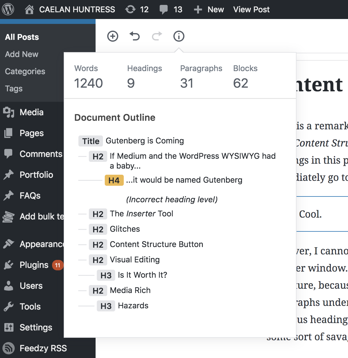
There is a remarkably useful button at the top of the Gutenberg Editor, titled Content Structure. This allows me to see, at a glance, all of my headings in this post. I can even click on one of those headings, and immediately go to that section of the post.
Super. Cool.
However, I cannot yet drag-and-drop the headings in the Content Structure popover window. I am certain this function will be rolled out sometime in the future, because right now, there is no way for me to move the 3 paragraphs under a heading up above the three paragraphs under the previous headings, unless I drag and drop all of them individually. (like some sort of savage.)
Eventually, I expect that I could open the Content Structure window, and drag an entire section to a different section of the post. But not yet.
Visual Editing
The best part of Medium is working on the front end, all the time. WordPress is leaning in this direction, and with the image block functionality, I think they are on the right track. Watch me set up a full width image:

Okay, never mind. It took me twenty minutes to try and make that image full width. It’s all glitchy now. Which brings me to….
Gutenberg Glitches
An easy caveat: I’m using the Gutenberg Ramp plugin, on a WordPress core that is still made to support previous versions of WordPress. This is also the early stages of the rollout, so I am quite sure this will improve over time.
However, I have noticed a few glitches while composing this post:
- Making links doesn’t always work. The Link editor doesn’t always take my text, and I often can’t add a link easily.
- Sometimes when I mean to backspace a word, it deletes the entire text block.
- There is no undo when this happens; the text block I am working on is just gone.
- The Fixed Background option to make images parallax often masks the image entirely in the editor
- Sometimes deleting blocks is problematic, and I have to convert to HTML and manually kill it in the code
- The images don’t display in the Editor the way they do in preview
Full Width Images
While you can create a media rich layout very quickly, it’s glitchy so far. Using blocks makes this limited.


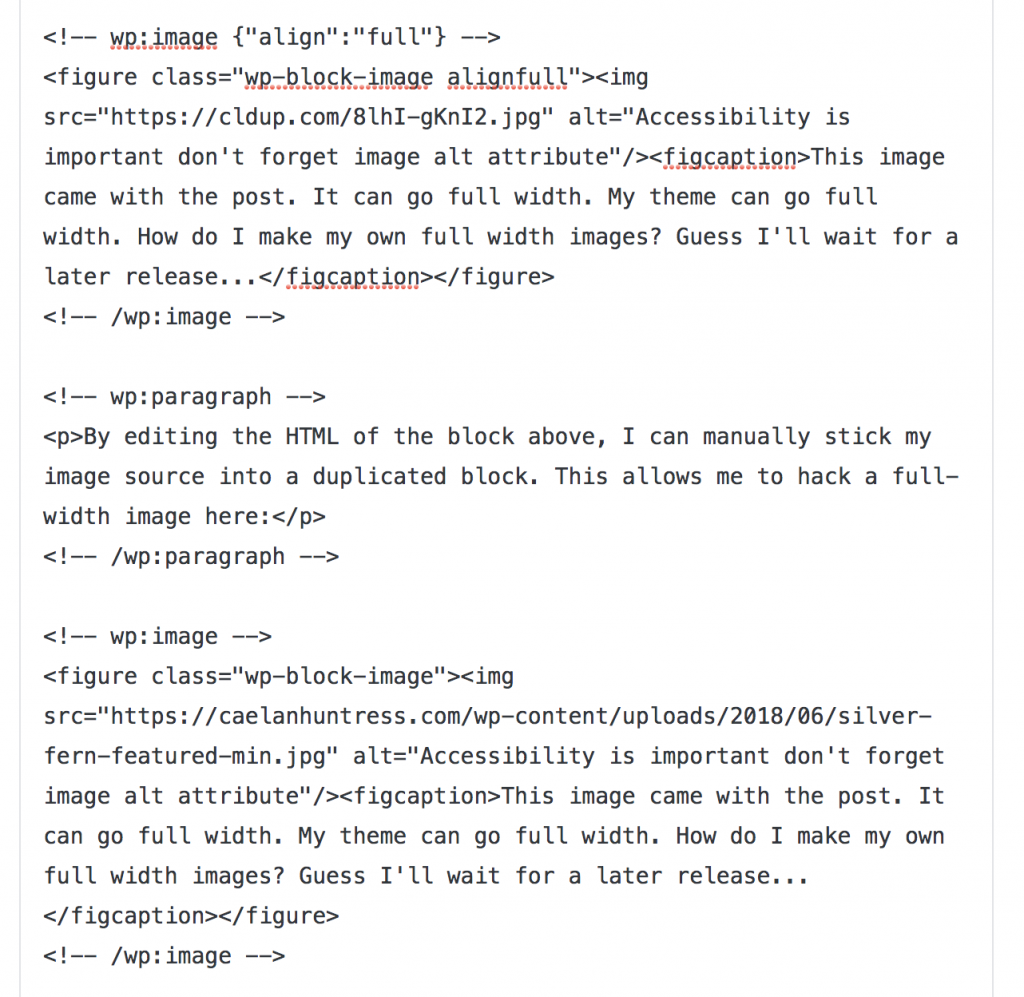
By editing the HTML of the block above, I can manually stick my image source into a duplicated block. This allows me to hack a full-width image here:

The Coding
At first, I thought I couldn’t get my hands into the HTML code of the entire post. It’s accessible, it just took some time to find.
First, I found the Block Settings allowed me to ‘Edit As HTML’ for any individual block. Useful, but not great, because sometimes I need to copy the entire HTML of a post and paste it into a text editor. (Find-and-replace works better there.)
For a while, I thought I couldn’t get to the full post HTML, until i finally found a toggle in the upper right hand corner. This allows me to toggle between the Visual Editor (which is now Gutenberg) and a full HTML view.
This was really interesting to see, because here you can see the inner workings of the Gutenberg code.

This code displays the block types, and assigns CSS classes to them. That’s all the Gutenberg editor is doing, and the HTML is basic enough that you can get in there and modify settings that you need to, which is what makes WordPress so extendible.
The screenshot above is the code of the full-width images. The lower section, I could not get it to become a full width image via block settings. At all. So I examined the code that was full width, and added the “alignfull” class to make it happen.
Pros & Cons
How did I get the anchor text link above to direct you way down here? Watch this video tutorial:
Gutenberg Pros:
- It doesn’t reload the page when you click ‘Save Draft.’
- The new Link editor has a quick toggle to ‘Open In New Window,’ and the previous one was 4-5 clicks to set something _blank
- Can modify HTML block-by-block without having to use a full page of code
- Image resizing can be done quickly and easily, offering a dropdown box with all your theme’s predefined image sizes, as well as percentage buttons to instantly cut it in half or quarters.
- Formatting is spread across more small menus, and often just-as-you-need-it
- Clicking up-and-down arrows to move blocks is intuitive and user-friendly
- Reusable Blocks can be used for CTAs
- Buttons are made quickly and look great. But….
Gutenberg Cons:
- You can’t get button links to open in a new tab. I even tried editing the HTML code to add “_blank” and it didn’t work, it just broke the button. This is such a basic and critical function, I’ll be surprised if it isn’t fixed when Gutenberg rolls out in the Core.
- Hard to get images to go full width unless duplicating the template’s existing images
- Can’t get full post HTML all in one screen easily
- Multimedia image management has limited functions
- Can’t drag and drop inline images
- The ‘kitchen sink’ of the former editing screen has lots of functions that I can’t easily access now
- Can’t move multiple blocks at once with arrows, have to cut and paste
- Can’t easily change the size of video embeds
- Sometimes my autosaving failed, and I couldn’t easily copy all the content to back it up
Gutenberg Hazard – Page builders
How will Gutenberg interact with page builders? Or themes that use a lot of shortcodes? I imagine that they will play separately, and for the (near) future, Gutenberg will not interfere with any of their custom functionality. But I worry that this direction could phase out some of the more heavily-coded page builders, and they may not be compatible with WordPress 6 or 7 way down the line.
(Do you see that massive DropCap above? Another nifty feature that is easy to use.)
Conclusion – Gutenberg FTW
By releasing Gutenberg in late beta to the general WordPress community, the Automattic team has been able to gain live feedback from thousands of websites before rolling out this editor in the WordPress core.
Gutenberg is coming to WordPress, one way or another. It will land on your website with a few glitches, and improve over time.
Overall, you’ve got nothing to worry about with Gutenberg. There is a learning curve you will need to go up eventually, just like you did when you first started writing WordPress posts. Based on my experience, you shouldn’t have too many issues when you make the change.
Subscribe to my newsletter for more insight into building your platform and your brand: https://stellarplatforms.com/subscribe


Leave A Comment