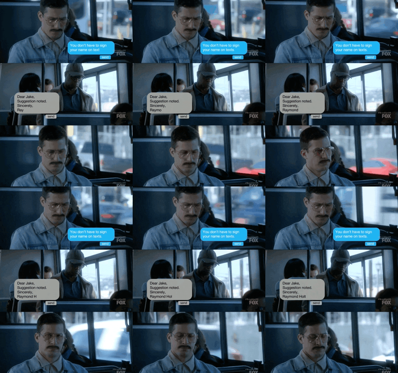
Your signature is your last impression.
When you send a digital communication, the way you sign the end of your message can impact your relationships, your positioning, and your conversions.
There are 4 main styles of signatures:
- Memo
- Streamlined
- Branded Palette
- Kitchen Sink
I’ll describe these signature styles in detail, and show you an example of each one.
The Memo Signature
The Memo is a brief, shorthand acknowledgement that the message is over. When you are talking with someone on a walkie-talkie or a CB radio, it’s common courtesy to end your verbal message with the word ‘over’ to let the other person know you are finished.
Nobody ends a brief, static-filled audio message with, ‘Thank you for listening, and I hope we get to communicate more in the future. I look forward to your reply.”
Well, almost nobody.

The Memo serves a critical function in rapid communication – it lets you know the message has not been cut off, and it is complete. This is why telegrams, messages passed via Morse code, ended with STOP. The clarity of the end was important.
This is the current email signature I have set up from my phone:
CH
Sent from my caduceus.
This lets the recipient know they have downloaded and received the whole message, but it doesn’t cloud the content with lots of peripheral calls-to-action. That’s what the other signature styles are for.
Streamlined Signature
My current favorite signature style is Streamlined. There are a variety of links, but no images or colors.
Images can decrease the likelihood your email makes it past the spam filter, and adding extra pressure on the deliverability of every email doesn’t make sense to me. Different email programs will interpret the images differently, so the only way you can be sure how your email will look would be to use a tool like Litmus, which lets you preview your email in multiple browsers and email clients.
For testing deliverability, use a tool like mail-tester.com to see how your current email signature works (or doesn’t). In my experience, the streamlined email has the best results with deliverability. When I use my gmail inbox to send email from one of my 5-6 main email addresses, this is how it looks:
Stay safe,
CAELAN HUNTRESSMarketer / Speaker/ Author/ Coach
Branded Palette Signature
These signatures are popular, because they extend your positioning. Do you have brand colors, or a brand font, or a headshot? Your signature can carry all these branding assets into every email you send.
Services like Wisestamp make the creation of a branded palette signature easy, but it does cost a few bucks. The cost is worthwhile – they have a variety of profiles, and they make the design and setup easy. Here’s a signature I made in five minutes using Wisestamp:

I can tell you from experience, trying to cobble something together by yourself could end up costing you more in time and cash. Bad branded signatures have big images, and if they are called from the wrong sources, the likelihood of ending up in the spam folder is high. Wisestamp does all the technical formatting necessary to make sure your email will hit the inbox properly.
The Kitchen Sink
This messy signature is appealing, because it puts a veritable website’s worth of information into every email. Adding ‘everything but the kitchen sink’ can make you feel like you are covering all of your bases.
But the Kitchen Signature can bee confusing for the reader, and overwhelming. If you offer too many choices, it’s likely that the user will take none of them.
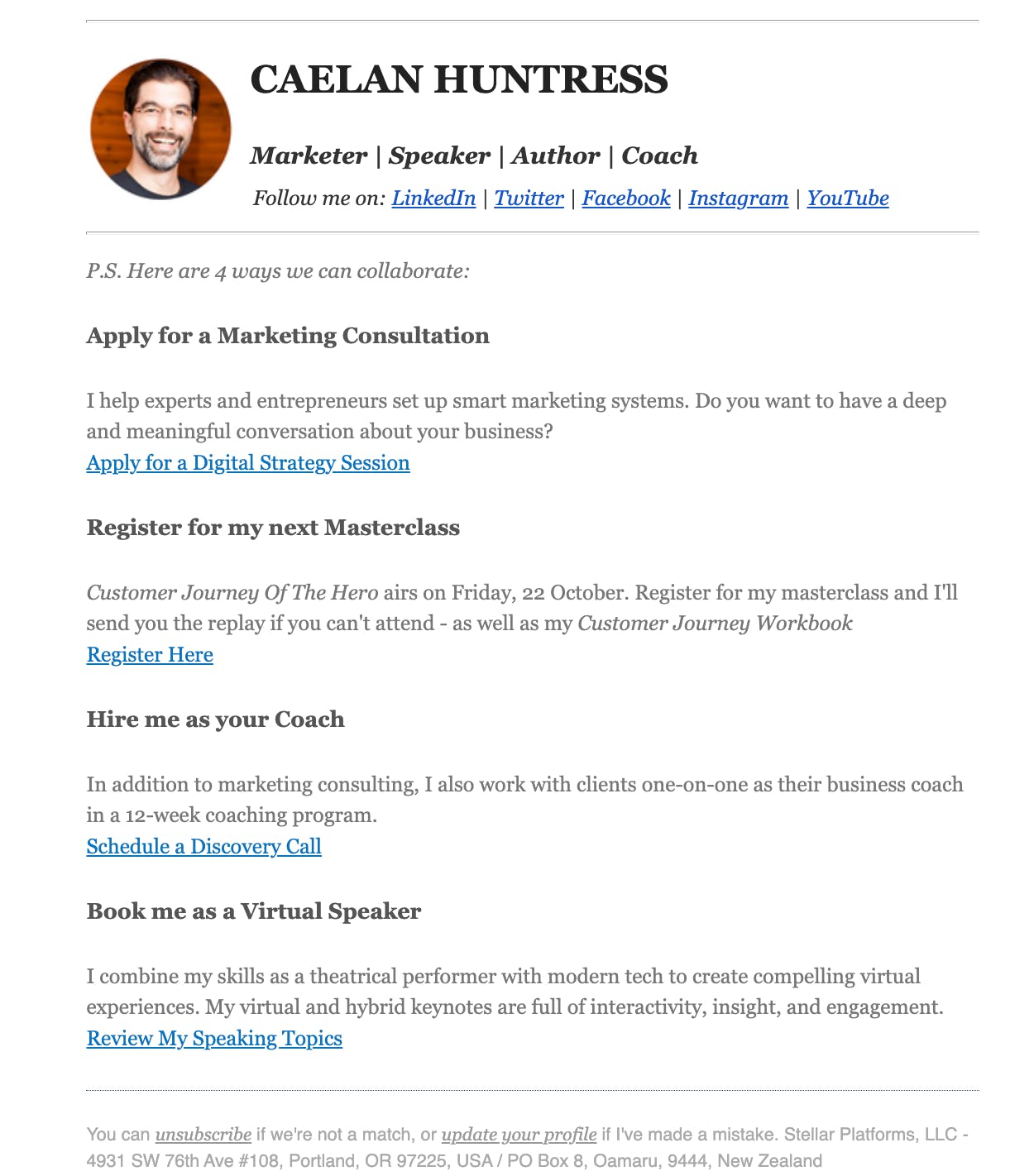
If you’ve been on my newsletter list for a while, you might remember this signature that I tested for nine months:

I used UTM parameters to track the clickthrough rates of these links. Over those 9 months, I received about 700 clicks on these signature links. Considering the size of my list and the volume that I send, this was a worthwhile result. Most of the traffic went to my monthly Masterclasses, so it was a great way to encourage attendance to my upcoming events.
I did not have any new clients come to me through the signature clicks, but what I did get was re-positioning on my offers, and reminders to my regulars about the kinds of things that I do.
I’ll be changing my newsletter signature style again later this year, when I migrate from ConvertKit to ActiveCampaign.
How do you end your email?
Selecting a good signoff is a matter of style and personality.
Here’s a brief list of signoffs you can use:
- Sincerely,
- Regard,
- Best regards,
- Best wishes,
- All the best,
- Be well,
- Cheers,
- Ciao,
- Big hugs,
- Thanks!
I used to use the final option as my standard, go-to signoff. It expressed gratitude and positivity. But then I found that in New Zealand, this was taken as presumptuous. If my email contained a request, for example, saying ‘Thanks!’ would imply my assumption that they would agree, which is a faux-pas in this culture.
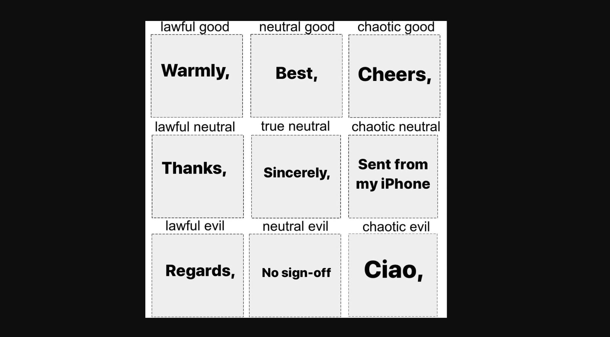
What really turned me off of using ‘Thanks!’ was this alignment chart:

There are not many things I am sure about in this world, but I am utterly convinced that I am not lawful neutral.
Send me an email at [email protected] and tell me one thing you like, and one thing you would improve, about your signature.


Leave A Comment