Prevent Simple Mistakes From Destroying Your Bottom Line
My new client was panicked. ‘We just paid for all this traffic,’ he told me breathlessly, ‘and we aren’t making any sales!’ I did a quick audit of his sales funnel. Right away, I found the problem: there was no Buy button on the mobile version of his sales page.
Back in 2011, nearly all website traffic went through a desktop computer. Ten years later, half of website traffic is mobile. My client’s sales page looked great on a desktop computer, which is what his designer had used to build it. But there was a piece of code preventing the most critical piece of his sales page - the button you click to buy - from showing on a mobile device.
I sent him a code snippet that fixed the problem, and immediately his sales funnel worked again. Just to be sure, I completed a purchase with my own credit card, documenting every step of the process with my Purchase Audit Workbook. This Google doc gave me a format for providing notes and feedback, as well as identifying any potential friction.
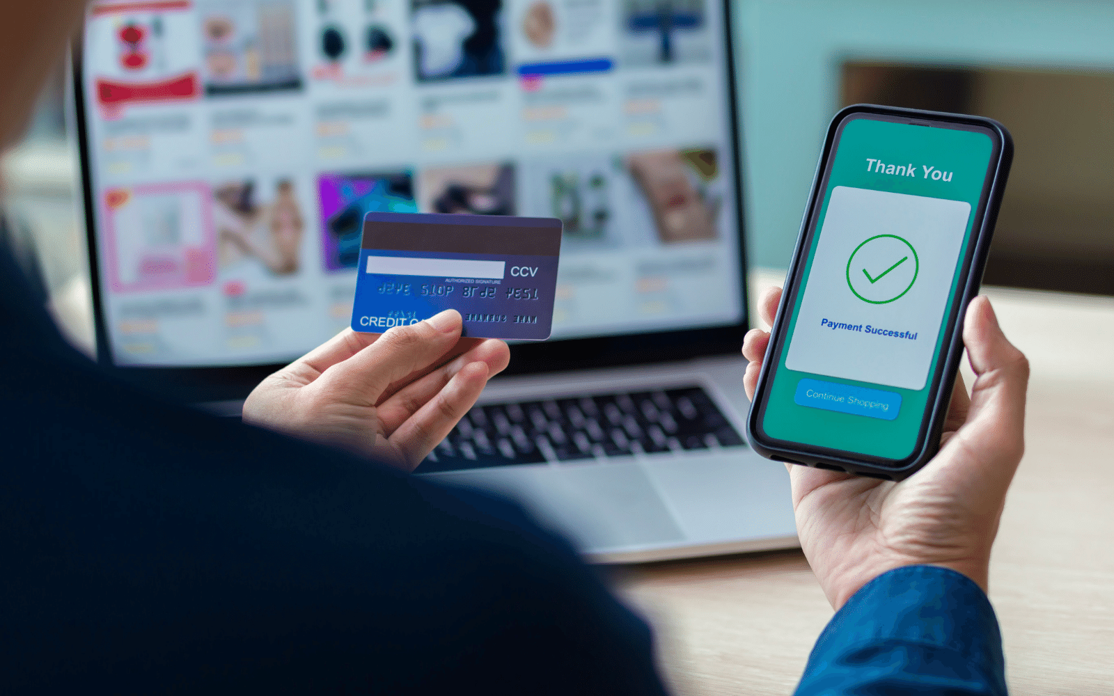
The Checkout Process is the Moment of Truth
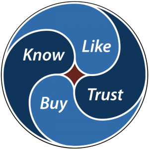
All the effort you put into your marketing can go to waste if people cannot complete their purchase. You could get people to Know you, by introducing yourself in a positive way; get them to Like you, by providing relevant and useful solutions to their problems; and get them to Trust you, by setting and achieving expectations; but if they cannot Buy from you, the 4-Step Marketing Cycle will never be complete.
 According to Baymard, the average online shopping cart abandonment rate is 69.23%. This means that nearly 7 in 10 people will visit an eCommerce store, consider making a purchase, put an item into their cart, and then will not complete the transaction. This is an extremely important number to know about your business. If you can reduce the shopping cart abandonment rate, and every other conversion ratio in your business remains constant, this directly translates into increased revenue for your business.
In the same study of 4500 consumers, more than 1 in 5 of the survey respondents cited “too long/complicated checkout process” as the reason they abandoned a purchase within the last quarter.
Imagine if out of every 4 customers you have had in the past, you earned one more extra customer. Without investing in any additional work or marketing. Making it easier for people to buy from you by fixing your checkout process can have that kind of effect on your business.
We All Use The Internet Differently
The browser and device that you use to create a sales page is not necessarily what your customer uses to view it. You may have a preference for Mac or PC, for Chrome or Firefox, for tablet or desktop. It’s natural that use your own native tools to create things for others, but keep in mind: they have their own preferences, as well.
How you pay for purchases might not be how your customer wants to pay. You may use credit cards to buy everything online, because that works best for you. You know for sure that your shopping cart works with credit cards. You have tested it yourself. But some of your customers may not have credit cards, because they use PayPal, or Venmo, or Bitcoin. They might be able to figure out some method to do it your way. But do you want to force them to do that in the moment of truth, when they make a buying decision?
Every time you ask someone to discard a preference they already have, in favour of your preference for how you like to do things, you introduce an element of friction. When there is too much friction in the purchase process, it is easy to change your mind about whether or not you want to buy at all.
I’m sure you have abandoned a transaction in the recent past. You’ve been trying to do something online, and you just can’t get the darn thing to work. You want to accomplish an action- complete a purchase, subscribe to a newsletter, fill out a form - and the tech just doesn’t work for you. In exasperation, you click away and get on with your life.
How many times does that happen for your customers? On average, it’s 1 in 5. If you can reduce that to 1 in 10, or 1 in 20, that improvement goes straight to your bottom line.
Reducing your Shopping Cart Abandonment Rate is the single most profitable statistic that you can improve in your business.

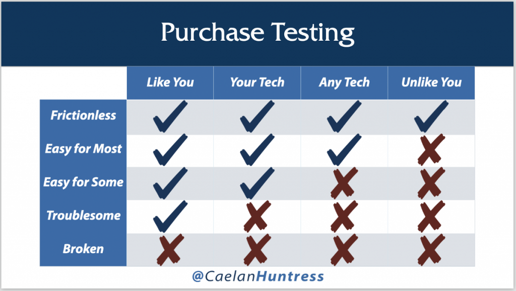
If everyone can make a purchase from you, regardless of their tech and their preferences, you have a frictionless checkout process. That’s the goal: every type of customer can make a purchase smoothly and easily.
The opposite side of the spectrum is when your systems are broken. Nobody can make a purchase, not even you. The worst place to be on this scale is one step above, when things are troublesome. If you can make a purchase, you may think everything is fine; but if nobody else can make a purchase, you might not even know.
For most businesses, many people find it easy enough to complete their purchase. Depending on the tech or the currency used, the entire purchase process can fade into the background. Ideally, it should be invisible for most people. Anytime someone notices something about your checkout process, it’s usually a problem.
How would you explain this to a five-year-old?
You don’t need to explain the physics of a water slide to a five-year-old. You let them watch it a couple of times, you help them up the ladder, and then they can handle the rest. They lean forward, put their hands in the air, laugh and scream, and splash at the end. Someone else takes care of everything from there - just like after a purchase, you come in and service the new customer. You can help a kid after they land in the water, but sliding down the slide is their own responsibility.
If someone has already made their buying decision, the path to the purchase should be like a water slide. Smooth, quick, and easy. Big buttons, clear instructions, lots of whitespace. The only options you want to give them are to continue with completing the purchase. Every layer of complexity is an invitation to friction.
Imagine if we had to stop the five-year-old halfway down the slide, and we asked them to perform some mundane action correctly. The fun would be taken right out of the experience! They may want to get off, and change their mind about the whole thing. The absence of friction increases the likelihood of success - it goes by so fast, you don’t have time to stop and reconsider.
If you really want to test the usability of your checkout process, give your credit card to an elderly relative. Ask them to complete a purchase from you, and don’t help them at all. Just watch and take notes. Observe where they get confused for invaluable customer research. Watch them puzzle out how to proceed, and see where they get stuck.
Only Testing Will Tell
Testing your checkout process is profitable work. It can be tedious, and expensive, and maddening - but this is the spigot through which your revenue flows. A glitch in your payment collection is the most expensive mistake in your business. You should treat your payment process with extra care. Having this final point in your pipeline flowing smoothly can have a dramatic impact on your revenue.
There is often a lot of room for easy improvement, if you can identify how to make purchasing easier for others. Use my Purchase Audit Workbook to document your purchase process, and remove any friction you can find.
This article is an excerpt from my book, ‘Marketing Yourself.’ You can read the whole book here.


Leave A Comment