Fix Your Lead Generation With a Simple Sales Funnel
To make pavlova, a delicate seasonal dessert in New Zealand, you need eight ingredients: eggs, sugar, vanilla extract, white vinegar, cornflour, cream, strawberries, and kiwis. If I gave you a shopping list, you could buy everything that goes into the dish. But you would not know how to make it.
For pavlova, you don’t just need eggs. You need beaten egg whites. The fruit goes on the outside, not the inside, and it is sliced thinly. The time in the oven is critical, and the order of the steps can make or break the dessert. Preparation instructions are just as important as the ingredients themselves.
Most websites are just a list of ingredients. They have a homepage, an about page, a blog, and headshots. Maybe there is a contact form, links to social media profiles, and a description of services and rates. After setting it up, people get frustrated that their website doesn’t bring them leads right away. It’s because they only provide a list of ingredients, not the whole recipe.
A good recipe tells you how to combine the ingredients to make them into a meal. The recipe provides specific, step-by-step instructions. This enables even inexperienced cooks to succeed.
Your customer could be buying what you sell for the first time in their life. If you provide clear, step-by-step instructions (in addition to listing all the ingredients), they will be able to follow your recipe on how to do business with you.
Websites Are More Than Content Storage
When you have a new set of photos, or write some great copy, or design a snazzy new brochure, what’s the first thing you do? Put it on your website, right? You can add content all day long to your website. But if it doesn’t help a stranger become a customer, it’s just contributing to the noise.
Every day on the internet, there are:
- 2 million blog posts created
- 294 billion emails sent
- 864,000 hours of video uploaded
- 400 million tweets tweeted
The average person on the internet is exposed to upwards of 5000 ads a day, according to the New York Times.
That is a lot of noise.
Imagine you are standing in a stadium full of cheering fans. But instead of yelling support for a team down on the field, everyone tries to get the attention of everyone else. That’s what it’s like to market yourself on the internet today. The competition for attention is fierce, and coming from everyone, everywhere.
“When you go to market with what you’re selling, everybody doesn’t care.” — Seth Godin
Your Promotional Material Is Not That Interesting
Uploading and archiving multimedia on a website is a delicate art. If done poorly, big photos and video files decrease your page load time, confuse new users, and add to the mess.
When I give someone a homepage audit, one of the first things I notice is their use of language. The words ‘I’ and ‘We’ are often overused. Bad websites are used as a substitute for introspective journaling. They describe how you think your business should represent yourself in the world. I cringe when I see three consecutive pictures of the same person from the same photoshoot (in three slightly different positions). Using the ‘royal We’ to talk about a one-person business is a rookie’s mistake.
If I clicked through your website to discover the fine print in the different versions of your brochure, I would be avoiding my own work: solving my problems. Nobody cares about you, or your business. They care about the problems they want to solve. Great websites focus on the problems of the customer, and provide a path to the solutions.
Your Website Is The Map To Your Sales Funnel
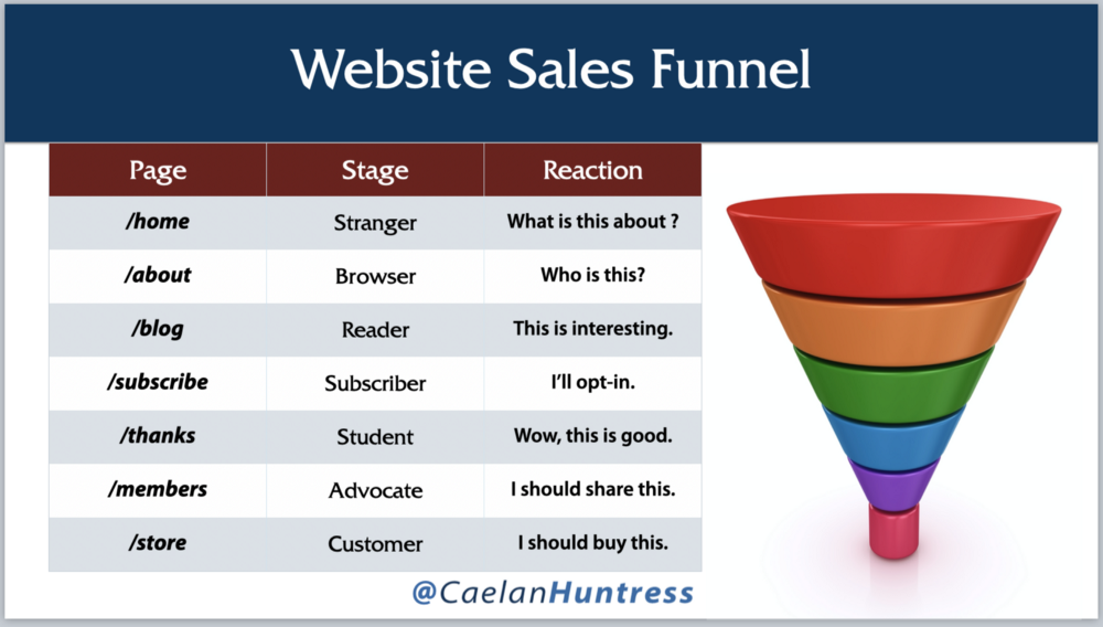
A sales funnel is the path from stranger to customer, and your website is the medium through which people take that journey.

Each page on your website can create an emotional reaction in your reader. This emotional reaction encourages them to go to the next stage of the funnel. Create content on each of these pages to create the emotional reaction in the graphic above. You don’t need fancy software, or expensive designers. You just need a simple progression for future customers to follow.
When I profiled 10 Websites With Great Homepage CTAs in 2019, I had one main requirement. Every good-looking website had to have a clear Call-to-Action. I opted in to every one of these sales funnels, so I could study how they convert new subscribers into customers.
- Susan Peirce Thompson’s CTA: Take the Quiz Now
- Darren Rowse’s CTA: Subscribe to Problogger Plus
- Tim Ferriss’ CTA: Click to Listen
- Grant Baldwin’s CTA: Join our Online Training
- Melyssa Griffin’s CTA: Click Here to Sign Up
- David Siteman Garland’s CTA: Sign up for free training!
- Derek Halpern’s CTA: Click To Get Free Updates
- Liam Austin’s CTA: Sign Up
- Nick Stephenson’s CTA: Get the Book
- Lewis Howes’ CTA: Sign up to learn these 3 simple steps
The websites all look pretty. As a website designer myself, I appreciate their aesthetics. But as a marketer, I understand the practical usefulness of having a clear, concise CTA right on the top of your homepage. When someone arrives at the homepage for the first time, they are given easy, non-threatening instructions for what to do next.
96% of first time website visitors are not ready to buy, according to Hubspot. 48% of businesses say that most of their leads require long cycle nurturing. A website visit is not likely to convert into a sale immediately, but it can begin a relationship.
That relationship may lead to a sale, eventually. The relationship does not happen on your website — it only starts there. The four steps you take in the Marketing Cycle — Know, Like, Trust, and Buy — are nurtured in your sales funnel, not your website. The website is only the map.
This article is an excerpt from my book, ‘Marketing Yourself.’ You can read the whole book here.


Leave A Comment